Wingdings Arrows: The Complete Directional Guide
Arrows are Wingdings' most useful glyphs — flow charts, directions, process steps, decorative pointers. This guide maps every arrow across the font families, the Unicode equivalents that paste anywhere, and the patterns that make diagrams look designed.
Wingdings 3: The Dedicated Arrow Font
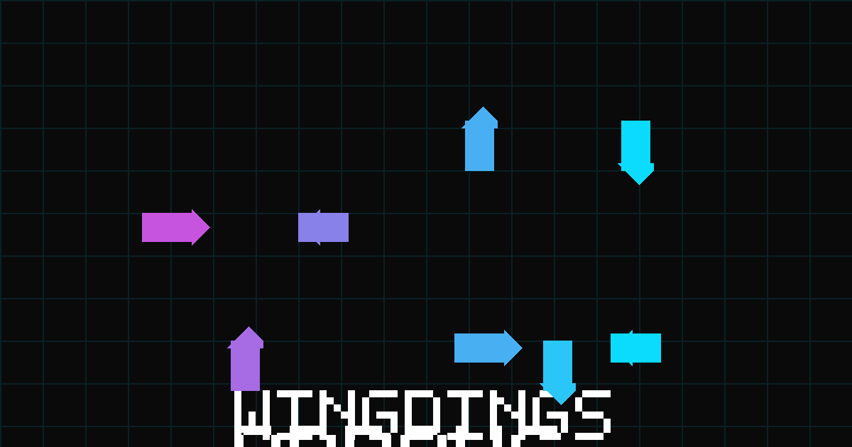
Wingdings 3 is arrows and nothing else — which makes it the rare symbol font that's actually a toolkit. The punctuation row covers the cardinal directions, the number row adds dashes and doubles, the letter rows contribute corners, diagonals, and navigation arrows (home, end, page-up). The core map:
| Key | Arrow | Key | Arrow |
|---|---|---|---|
| ! | ⬅ left | " | ➡ right |
| # | ⬆ up | $ | ⬇ down |
| % | ↖ northwest | & | ↗ northeast |
| ' | ↙ southwest | ( | ↘ southeast |
| 1 | ↔ left-right | 2 | ↕ up-down |
| P | ↻ clockwise | Q | ↺ counter-clockwise |
Complete table with all weights and corners on the chart's Wingdings 3 tab; the dedicated translator converts text into arrow runs for diagrams. Because the glyphs are monochrome and geometric, they scale beautifully — the quality that made this font a diagram-maker's standard (thirty years of flowcharts agree).
The Arrows Hiding in Wingdings 1
Wingdings 1 has a small arrow set scattered among its mixed glyphs — most usefully, the lowercase f–i row renders thin directional arrows (f left, g right, h up, i down), plus the return/enter-style arrows on @ and A. These get borrowed constantly because Wingdings 1 is the font everyone has open. If you're working in Wingdings 1 for the faces and hands anyway, the thin arrows are right there; if arrows are the job, Wingdings 3 is the professional answer. The meanings guide's utility-belt section covers both sets with cultural notes.
Unicode Arrows: The Paste-Anywhere Versions
Same story as every glyph family we cover: the popular arrows all live in plain Unicode and paste into anything — no font. The heavy set (⬅ ➡ ⬆ ⬇ and the diagonal quartet) is what our copy wall serves, and what most chat and bio arrows actually are when you see them in the wild. The thin set (← → ↑ ↓) renders more typographically; the fancy set (⟹ ⟶ ⇛) serves math and logic contexts. All coexist happily with the dingbats — a bio line mixing a hand, an arrow, and a star is three characters from three Unicode neighborhoods, and that mixing is precisely how symbol-decorated text works.
Diagram Patterns That Look Designed
- Process line: step text separated by ➡ — reads as a flow even in plain chat messages.
- Direction stack: ⬆ ⬇ pairs for expand/collapse or show/hide affordances in text UIs.
- Corner connectors: Wingdings 3's corner arrows (the 8-? row) turn ASCII-box layouts into clean-looking ones.
- Rotation: ↻ for refresh semantics — the pair with our site's own theme-switcher aesthetic (try the buttons on any page).
For slides, the PowerPoint guide shows arrows-as-bullets; for documents, the Word guide covers the font route; for everything else, the wall and the main translator output all families at once.
Accessibility Notes for Arrow Decorators
A paragraph that matters if your arrows are for public-facing content: screen readers handle arrows poorly-to-variously — some announce "rightwards arrow," some skip them, some read the underlying character name. If your arrow carries meaning ("next step", "click here"), pair it with the word so the meaning survives translation to audio: "Next ➡" not a bare arrow. Decorative dividers are exempt (they're visual seasoning, and skipping them loses nothing). The same rule applies to all glyph decoration — the Discord guide formalizes it as etiquette — and it costs nothing to follow while making your content work for everyone. Second note: arrow-heavy text can confuse right-to-left rendering in mixed-direction contexts (a ← in an RTL paragraph points the reader's eye wrong); in bi-directional content, prefer the word or use the direction-neutral ↕ style. These are edge cases, but they separate the thoughtful symbol user from the careless one, and the thoughtful one's content survives contact with the wider internet intact.
The Arrow Cheat Sheet
Print-worthy summary of everything above. In Wingdings 3 (the dedicated font): punctuation row = cardinal directions (!"#$ → ⬅➡⬆⬇), number row = doubles and dashes, letters = corners and navigation. In Wingdings 1 (the everywhere font): thin arrows on lowercase f-i, returns on @-A. In Unicode (the universal layer): heavy set ⬅➡⬆⬇⬗⬖⬘⬙ for chat and bios; thin set ←→↑↓↖↗↘↙ for typographic contexts; exotic set ⟹⟶⇛ for math. For diagrams: Wingdings 3 in Office, Unicode everywhere else. For bullets: the PowerPoint guide's customization recipe. Every one of those references lives on this site — the arrows guide you're reading is the hub, the linked pages are the spokes, and between them every directional need is one click from solved.
Beyond Basics: Where to Explore Next
Your arrow journey from here, mapped by intent. If you diagram: the Wingdings 3 tab of the chart plus the dedicated translator is the professional toolkit; pair with the PowerPoint guide for slide-scale work. If you decorate: the copy wall's heavy arrow set is the bio-and-chat palette; mix with hearts and stars per the hearts guide and the meanings pages for signaling layers. If you decode: arrows in mystery messages are usually structural separators — skip them, decode the text around them with the decoder, and the layout maps itself. If you teach or present: arrow bullets and directional callouts are the two-minute slide upgrades covered in the PowerPoint guide. The arrows family is the most functional of the symbol sets — unlike hearts and music notes which signal feeling, arrows direct — and that functional character is why they appear in every context this site serves: Office documents, chat messages, bios, diagrams, fan-game clues. One glyph family, every direction, universal use. That is a closing sentence the 1992 designers would have enjoyed.
The Arrow in Cross-Cultural Context
A final enrichment for the well-rounded symbol user: arrows carry meaning beyond direction. The ↑ arrow is the universal "upvote/improvement" marker across forum and social platforms; ➡ doubles as "swipe" or "see next" in interface-savvy communities; ↻ became the refresh/reload idiom everyone recognizes from browser chrome. Wingdings 3's corner arrows carry process semantics in flow-chart culture — ↳ the classic "and then" continuation. Using arrows with awareness of these secondary meanings turns your decoration into communication: a bio ending in ➡ is an invitation to a link; a row of ↗ glyphs reads as growth-mindset branding; the ↻ signals "this content refreshes." None of this is in the font's documentation — it emerged from twenty years of internet convention — but it is exactly the kind of living meaning our meanings guide exists to document. The arrows family is the best entry point to that layer of symbol literacy: familiar enough to use immediately, deep enough to reward attention. Point yourself anywhere — the characters will get you there.
Wingdings 1 quick reference
| ü | ✓ | û | ✗ |
| þ | ☑ | ÿ | ◻ |
| J | ☺ | Q | ✈ |
| M | 💣 | N | ☠ |
| O | ⚐ | R | ☼ |
| S | 💧 | T | ❄ |
Mapping verified {TODAY} · provenance: /provenance/
Full tables: complete chart · A–Z alphabet · check marks